Ingredients
Packaging
Brand identity
Photography
Approach
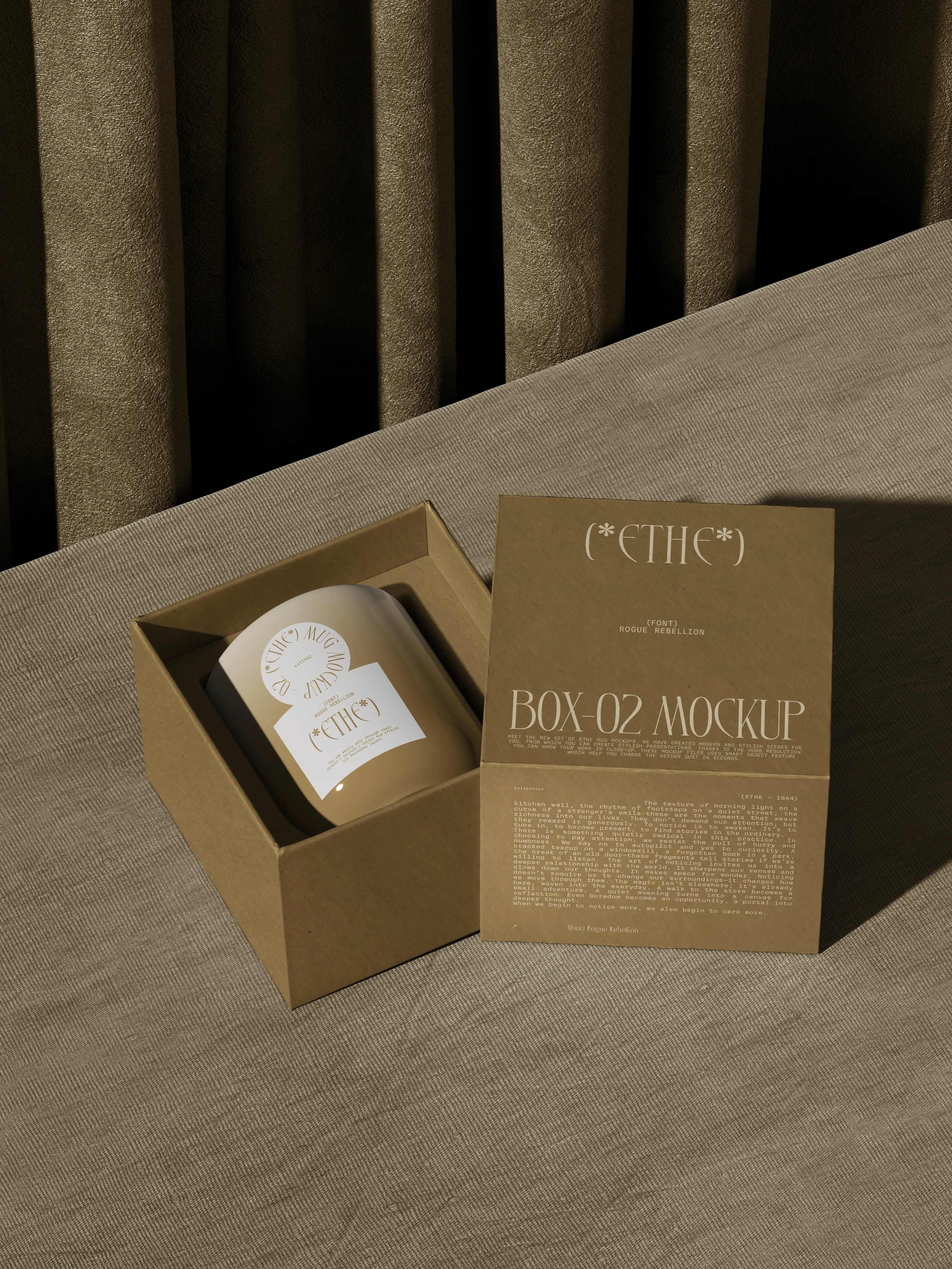
We left the mugs bare and put the brand on a small round stamped label and a kraft gift box that also does the shipping.
Method
Let the clay do the talking
Ethe throws every mug by hand, and no two glazes come out the same. They asked us for a brand that would get out of the way.
The problem
Their first labels were big, glossy and printed in five colours. Next to a matte stoneware mug they looked like price tags.
The process
We worked from the mug outwards.
Start with the glaze. We matched the label paper to the unglazed foot of the mug.
One round stamp. The mark is a circle with the name inside, small enough to sit on the side of a cup.
A box that does two jobs. The gift box is also the shipping box, so nothing gets thrown away on arrival.
The result
The mugs now go out in a plain kraft box with a single round label, and the online shop sells out the way the market stall does.
We shot the product photos too, in the studio’s own window light.
“They understood the mugs should do the talking. The box only has to get them there in one piece, and it does.”
Clara Nunes, founder of Ethe
Gallery