Ingredients
Brand identity
Event design
Approach
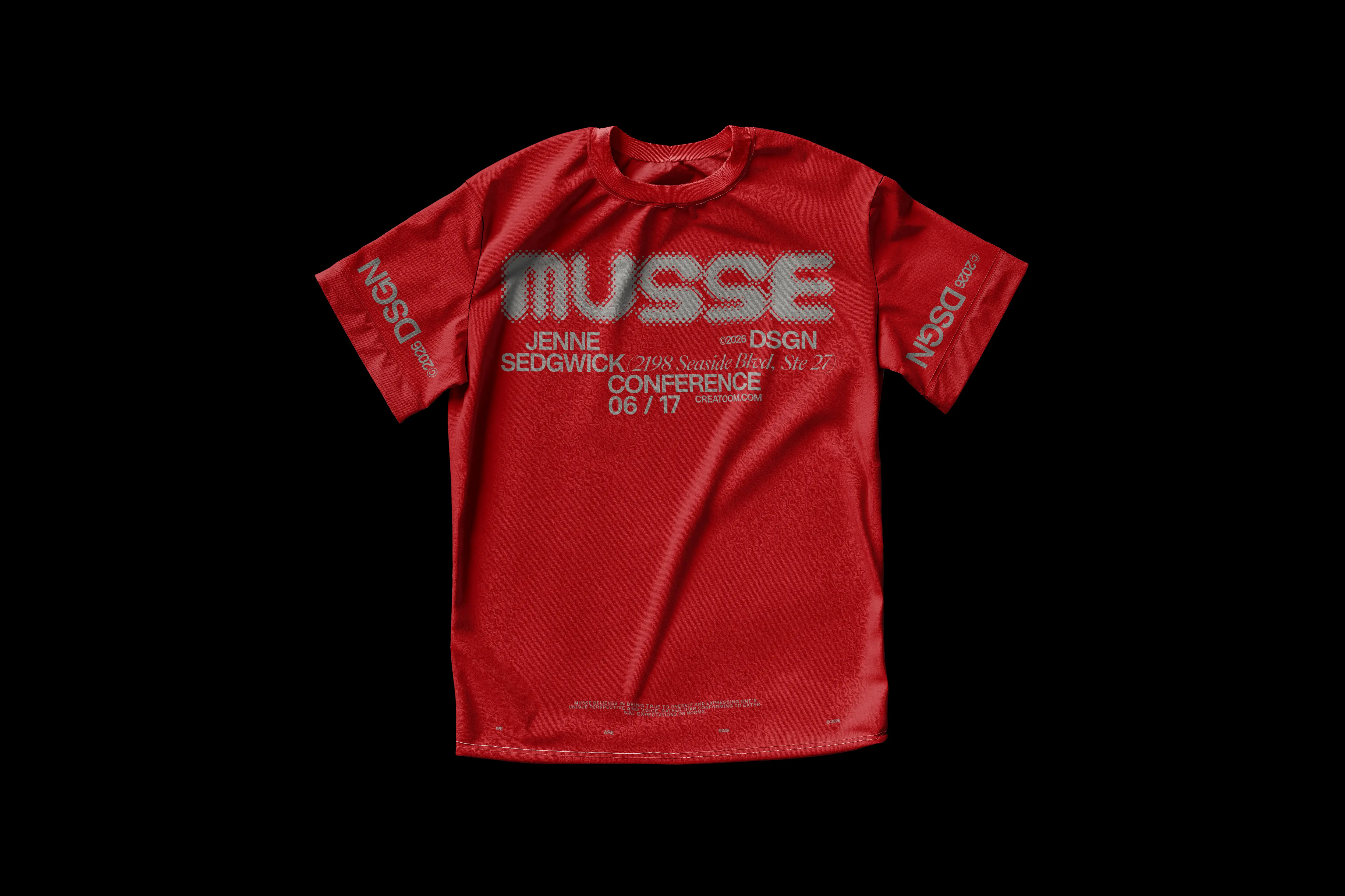
We drew a stretchy wordmark that fills whatever it lands on, kept it to one red and one black, and printed it on flags, tees, notebooks and a guidelines book the volunteers actually read.
Method
A festival with nothing but a name
Musse brings together forty studios for one week every spring: open doors, talks and late shows. The organisers came to us four months before the first edition with a date, a list of venues and no visual identity at all.
The problem
A festival lives in a lot of places at once: flags on lampposts, lanyards, tote bags, a programme, a website. Most of it would be made by volunteers, in a hurry, on whatever printer was nearby.
The process
We gave ourselves one rule: it has to survive a bad printer.
Clay first. We pressed the letters out of red plasticine to find a shape that still reads when it gets squashed.
One colour, one black. Red does the shouting; black holds the programme.
A book, not a PDF. The guidelines became a pocket book with every rule on one page.
The result
The wordmark stretches to fill any shape, from a flag to a sticker, and the volunteers made over 300 pieces without asking us a single question.
That is the best review a design system can get.
“Our volunteers made 300 pieces from the guidelines book and never once called the studio. That has never happened before.”
Tom Okafor, festival director at Musse
Gallery