Ingredients
Campaign
Art direction
Motion
Approach
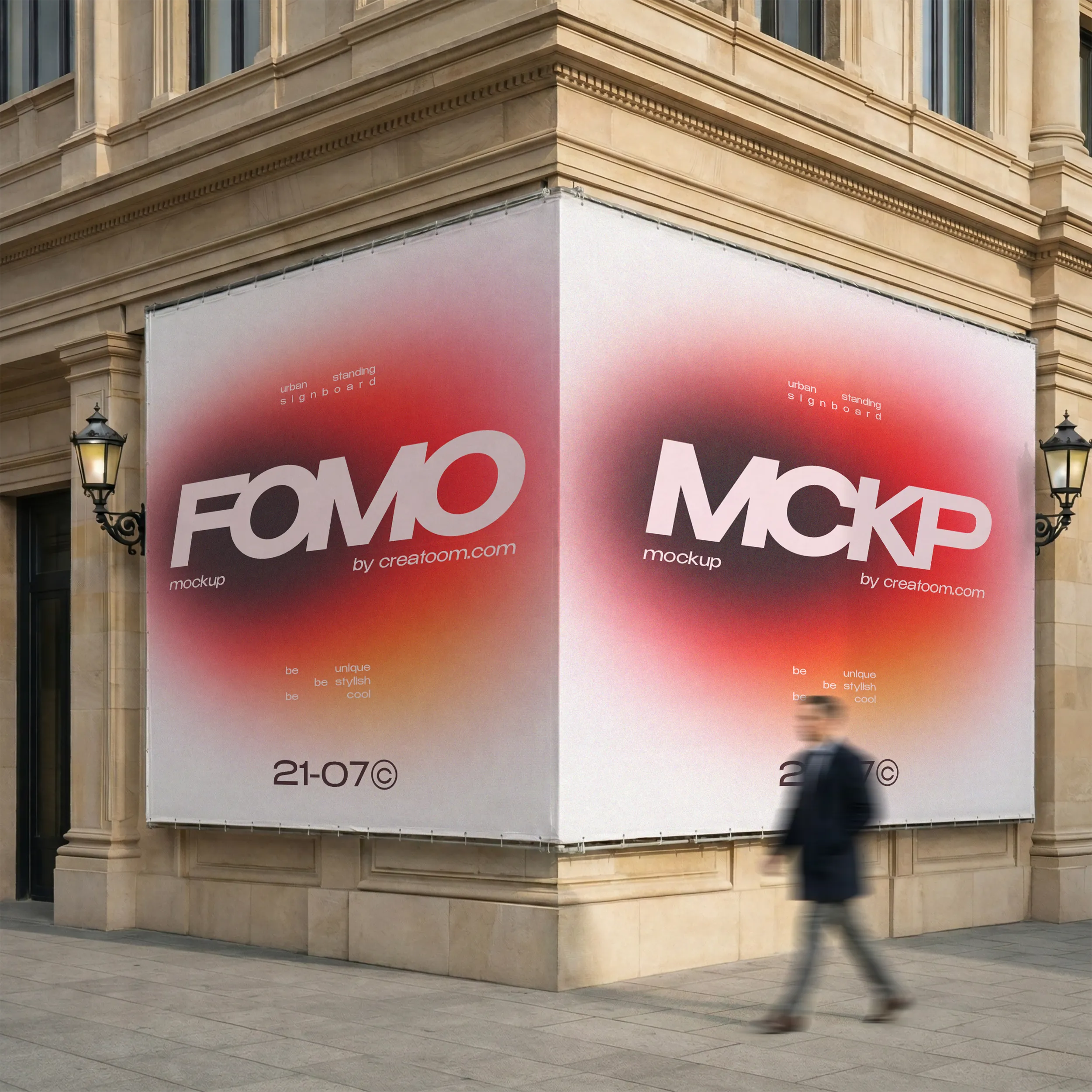
We built the campaign on one huge word and a date, then ran it on billboards, airport lightboxes, a subway wall and the screen at the launch party.
Method
Two days to make a city look up
Fomo’s collections sell out fast, which is good news for the label and bad news for anyone who hears about them late. For the 21-07 drop they wanted a campaign people would see, remember and photograph within a single weekend.
The problem
A billboard gets about three seconds of attention, and the label had a lot to say: the date, the pieces, the pop-up address. Something had to give.
The process
We cut the message down until it fitted on the side of a bus.
One word, one date. FOMO and 21-07, nothing else at first glance.
A soft glow. A blurred gradient that looks lit even on paper, so the posters and the lightboxes read as one campaign.
Test at walking pace. We stuck paper versions up on the studio stairs and asked people what they remembered on the way up.
The result
The posters went up on Thursday and the queue started on Friday night.
The launch screen ran the same glow in motion, and the photos people took of the billboard did the rest.
“One word and a date. I didn’t believe it would be enough until I saw the queue on Friday night.”
Ana Ribeiro, head of brand at Fomo
Gallery