Studio Mallow template
Design system
Everything this template is built from. The colours, type and components on this sheet are the real styles, so changing one here changes it on every page.
Build with it
In Framer’s Agent panel, type /design-system and what you want to build a new page from this system, or /make-it-yours to turn the template into your own site.
Colour styles
Colour
25 colour styles in three folders, named by what they look like. Brand for fills and accents, Neutral for pages, paper, lines and the clay light, Text for every text colour. Change one in the Assets panel and every page follows.
Brand · 6
Fills, accents and the toy-key colours.
Orange
#FF511C
Primary buttons, pins, the Work tape and the Contact key.
Pink
#E192C7
Mallow, the bubble wrap and the About key.
Yellow
#FFBB00
Hints, tape, price tags and the Services key.
Lilac
#9A89E3
The Process slab, the footer mat and the Work key.
Blue
#72A7E3
The showreel TV, the testimonials slab and the Journal key.
Green
#8AB50E
Three small touches in the footer.
Text · 2
The two colours every text uses. Change them here to recolour all type at once; fills and lines keep the Neutral colours.
Text/Black
#2A1D17
Every text on light fills: headings, body, labels, buttons on Pale Grey.
Text/White
#FBF7F1
Every text on dark fills: the Join card, the Statement slab, the lightbox captions.
Neutral · 17
Whites, greys, tans and blacks for pages, paper, text, lines and the clay light.
White
#FFFFFF
Pure white, for the Page Hero tape on bright colours.
Warm White
#FBF7F1
Light parts on dark fills, such as the Statement slab’s words. Text uses Text/White.
Pale Grey
#F2F2F2
Cards, notes, paper and tiles.
Light Grey
#EAEAEA
The page background.
Warm Grey
#6F6358
Quiet small print and meta lines.
Tan
#D9B98C
Boards and parcels: the contact board, the brief desk.
Deep Tan
#C9A574
Rope, cords and kraft shading.
Warm Black
#2A1D17
Dark fills: the Join card, trophy bases, the till screen. Text uses Text/Black.
Black
#000000
The button’s arrow blob and small dark details.
White 50%
White at 50%
The crisp top-left rim of raised clay, tape and the cutting mat’s ruler.
White 22%
White at 22%
The soft glow inside that rim, and the cutting mat’s lines.
White 12%
White at 12%
The rim on dark fills.
White 5%
White at 5%
The glow on dark fills.
Warm Black 10%
Warm Black at 10%
Thin dividers between list rows.
Warm Black 26%
Warm Black at 26%
The inner shade of raised clay, bottom right.
Warm Black 42%
Warm Black at 42%
Cast shadows. On the site Clay Light tints them from the fill.
Warm Black 92%
Warm Black at 92%
Behind the full-screen reel player.
Text styles
Type
Two families. Bagel Fat One for headings, display lines and prices; Bricolage Grotesque for reading, labels, buttons and the wordmark. Sizes read desktop / tablet / phone and step down by themselves.
Headings, display and prices
Bagel Fat One
Reading
Bricolage Grotesque
Labels, buttons and the wordmark
Bricolage Grotesque 600 to 800
Display
Bagel Fat One, 220 / 150 / 72 px, line height 0.82, tracking -4%. The giant Showreel word.
Soft
Scroll Line
Bagel Fat One, 220 / 170 / 120 px, line height 0.82. The one-line statement that slides sideways on Home.
We make
Wordmark XL
Bricolage Grotesque 800, 330 / 220 / 100 px, tracking -6%. A full-width mallow wordmark.
mallow
H1
Bagel Fat One, 160 / 112 / 64 px, line height 0.88, tracking -3.5%. One per page.
Hello, we’re Mallow.
H2
Bagel Fat One, 96 / 72 / 44 px, line height 0.85, tracking -3%. Section headings.
What happens next
H2 - Small
Bagel Fat One, 64 / 52 / 36 px, line height 0.95, tracking -2.5%. Headings inside cards and the article title.
Keep unpacking
Statement
H2 - Small set as a paragraph, for a big sentence that isn’t a heading.
We try every idea in clay first.
H3
Bagel Fat One, 36 / 32 / 26 px, line height 1.05, tracking -2%. Card titles and the house rules.
Clay before pixels
H3 - Small
Bagel Fat One, 24 / 22 / 20 px, line height 1.15. Small card titles, captions and tile names.
Nettle & Bloom
Price
Bagel Fat One, 52 / 46 / 44 px, line height 0.95. The price on a Price Tag.
£3,500
Tape
Bagel Fat One, 113 / 76 / 40 px. The page title punched into the Page Hero’s label tape (h1).
Work
Badge
Bagel Fat One, 24 px, line height 1. The word on an Honour object: 1st, Best, a magazine’s name.
1st
Tape Small
Bagel Fat One, 16 px, uppercase, tracking 14%. The Page Hero’s tag label.
Case studies
Label Large
Bricolage Grotesque 600, 18 px, line height 1.3. Button labels, nav links and names; a paragraph, not a heading.
Journal
Wordmark
Bricolage Grotesque 800, 28 px, tracking -4.5%. The mallow in the logo lockup.
mallow
Paragraph Large
Bricolage Grotesque, 22 / 20 / 18 px, line height 1.4. Section intros.
Tell us what you’re making and we’ll help shape it. We reply within a day, Monday to Friday.
Paragraph Medium
Bricolage Grotesque, 16 px, line height 1.5. Body copy and card text.
We talk about the goal, the timing and the budget, and you leave with an honest view.
Paragraph Small
Bricolage Grotesque 500, 14 px, line height 1.5. Small print, captions and tile notes.
A real person on the team reads every note and replies within a day.
Label
Bricolage Grotesque 600, 13 px, line height 1.2. Tags, meta lines and small labels.
Identity · Packaging · 2024
Link styles
Links
Four link styles. Nav Link for menus, Editorial Link inside paragraphs, Inverse and Footer Link for text on dark or bright fills. Hover a sample to see it change.
Nav Link
Warm Black. Hover and the current page turn Orange.
Editorial Link
Orange with a thin wavy underline 3 px below. Hover turns it Warm Black with a straight line 5 px below.
Inverse Link
Warm White. Hover turns it Pale Grey with a wavy Orange underline, 4 px thick.
Footer Link
Warm White. Hover adds a 2 px Orange underline, 5 px below.
Navigation cells and menu links
The nav bar and phone menu are one Navigation component. These are its link states; edit them there and every page follows.
Desktop link
Live Nav Link instances from the nav pill; hover one to see it. Heading 4 on a soft pill that turns Yellow on hover. Call To Action is the Orange pill at the end.
Phone link
The live Links - Phone list from the open menu: H2 - Small links with the Sprinkles squeeze. The current page uses the Nav Link style.
Open menu
Current page
Layout
Spacing
Desktop
1200 px and up, 40 px side margins (48 on inner-page heroes)
Tablet
810 to 1199 px, 32 px side margins
Phone
Up to 809 px, 20 px side margins
Spacing scale
Gaps and padding come from this scale: small steps inside cards, large ones between sections.
8
16
24
32
40
48
56
72
96
120
160
120 to 160 px above and below on desktop, 96 to 120 px on tablet, 88 px on phone and 72 px inside coloured slabs.
40 px on desktop (48 on inner-page heroes), 32 px on tablet, 20 px on phone. No max width on any section.
Everything is rounded, like clay. Pills for buttons, tags, chips and hints; 20 to 30 px for cards, notes and paper; 36 to 48 px for section slabs, a step smaller on tablet and phone; 12 to 22 px for photos inside their frames.
Few lines. A thin Line divider (Warm Black at 10%) between list rows and dashed Warm Grey rules on tickets and tags. Shapes are told apart by colour and shadow, not borders.
One light, from the top left: raised layers get a crisp rim and a soft glow on their top-left edges and a deeper shade at the bottom right, and their shadows fall down and to the right. Wells and checkboxes are pressed in. Draw shadows with the Neutral whites and warm blacks and add Clay Light: it casts each one in the layer’s own fill colour.
Springs, not tweens: things squash, overshoot a little and settle in 0.4 to 0.9 s. Hover lifts and tilts, press sinks. Entrance effects start from the second section, never the first. Pages change with two sliding sheets. Reduced motion turns movement off.
Components
Components
Site-wide
On every page, or in the nav, footer and inner-page heroes.
Button
The clay pill with an arrow blob. Primary on light fills, Light on coloured slabs and photos, Big for the footer call to action. Label, link and New Tab are variables; it squashes when pressed.
Primary, Light, Big (each with hover and pressed)
Tag
A pill label above section headings: Dark is the Pale Grey pill, Light the Yellow one.
Dark, Light
The house rules
Clients’ words
Footer Link
A text link with an Orange dot that stretches on hover. Light is for dark fills. Arrow and New Tab are switches.
Default, Light (each with hover)
Nav Link
One link in the nav pill: a soft pill that turns Yellow on hover. Call To Action is the Orange pill. Label and link are variables.
Default, Call To Action, each with hover
Logo Lockup
The mallow mark and wordmark from the nav pill. Hover squashes the mark.
One variant + hover
Mallow
The studio’s clay marshmallow: a soft blob in Colour with eyes, cheeks and a dent on top. It hops into the contact form’s thank-you note (Code - Sent Note finds it by the name Mallow).
One variant
Label Maker
The clay label maker the Page Hero’s title tape runs into. Hover turns the letter wheel and squeezes the handle.
Variants: Large (desktop), Medium (tablet), Small (phone)
A
B
C
D
E
F
G
H
I
J
K
L
Page Hero
The whole hero section of every inner page (Work, Journal, Book a call, 404), so its padding is set in one place: Desktop 80 / 48 / 72 / 48, Tablet 96 / 32 / 56 / 32, Phone 110 / 20 / 40 / 20 (pick the variant per breakpoint). A dark tag label, then the title punched on a label tape in Tape Colour (turn on Dark Letters for light tapes like Yellow) running into the Label Maker, an intro, an optional Primary button, a quiet link and the studio clock (Show Clock). Leave a label empty to hide it.
Desktop, Tablet, Phone
Toy Key
A clay keycap that is a link, for the footer’s toy keyboard. It sinks a little on hover and presses down on click. Screen Title and Screen are what the keyboard’s screen shows for it (Codes/ToyKeyboard.tsx); leave Legend empty to hide it.
Big, Small, hover, pressed
Home
Top to bottom, the way they appear on the home page.
Hanging Card
One service on the Home washing line: number, name, a clay icon, up to five Sub-services (each hides when empty), a line and a link. It hangs from a peg in its colour; hover floods the card with that colour. Add a service by duplicating a card in the Track.
Variants: Default, Small (+ hovers)
04
Objects and merch
Product design
Prototypes
Production
Totes, pins and the odd ceramic, shaped in clay before they are made.
Sub-service
One line of a Hanging Card’s list: a clay dot in the card’s colour and the text. The card binds Sub 1–5 and its Colour to five of these and hides the empty ones; on hover the dots turn Pale Grey.
One variant
Strategy
Framer build
Recipe Item
One line of the recipe card’s You bring list: an Orange dot and the text.
One variant
A rough idea, even a scribble
A budget, roughly
One person who can say yes
Turntable Card
A project on the Home turntable: the cover in a Pale Grey frame, then title and byline. Turntable.tsx stands them round a ring; on the canvas they sit in a row.
Turntable Card, Small

Price Tag
A plan on a hanging clay tag: number, plan, optional badge and prefix, the price in the Price style, up to five features and a button. Fill, Text and Bright Button set the colours.
One variant
03
Most picked
Monthly partner
From
£2,500
a month
Two design days a week
One shared request board
Pause or stop with 30 days’ notice
Client Row
One client in the Home list: logo and name on a rule. Hover lifts it into a Pale Grey pill, shows up to three tags and floats a photo of the work. Phone, used on tablet and phone, shows the photo and tags all the time.
Default, Phone (+ hover)


Receipt Line
One line on the Home receipt (In numbers): Label, a dotted leader, Value in the Badge style and an optional Note, hidden when empty. Add a line by duplicating one in the receipt’s Lines stack, and keep at least three: the paper feeds out of the till as it scrolls in, starting 240 px up. In a sideways row give the till a fixed width.
One variant
Launches since 2019
60
Clutch rating
4.9
from 32 verified reviews
Days to reply
1
Video Testimonial
A client on camera: a clay TV in TV Colour and Knob Colour that opens the video (a file or a YouTube link) full screen, with the quote, name and role below. Variation tilts each TV.
Default, Small


Availability Ticket
When the studio can start, as a clay ticket: label, title and line on the left; the live Studio Clock (Show Clock) and a button on the stub. Set Background to the colour it sits on, so the punched notches match.
Desktop, Phone
Recipe Step
One step of the Process recipe card: title, a weeks pill and a line. It ticks itself off (Done, with a scribbled strike) as it scrolls past the middle of the screen.
To do, Done
FAQ Bubble
A question as a chat bubble. Tap it and three dots type for a moment, then the answer pops in; tap again to close. Question and Answer are variables.
Closed, Typing, Open
How much does a project cost?
One fixed price after our first chat, so there are no surprise invoices. Tell us your budget and we’ll say honestly what fits.
How long does it take?
Ask
Journal Book
An article on the Home bookshelf: a spine with the title and category in its category colour that opens into a card with the cover on hover. Row is the tablet and phone version.
Spine (+ hover), Row


About
The hide-and-seek hero, the story road, the honours shelf, the studio film strips, the team and the brief desk.
Seek Object
A clay blob with an icon, scattered round the About heading. Hover or tap it and it squashes and a speech bubble pops out with the person’s photo, name and a silly title. Use Left Bubble near the right edge so the bubble opens inwards.
Seek Object, Left Bubble (each with hover)

Inês
Keeps every tram ticket
Inês
Keeps every tram ticket
Story Row
One stop on the About timeline: a tilted clay card with a photo, year, title and one line. Keep the stops in year order with the latest last, each in its own colour, and alternate Left and Right along the rope. The photo hides when Image is empty.
Variants: Left, Right

2019
A table in Alfama
Two designers, one borrowed table and a bag of plasticine.
2026
Sixty launches
Seven people, one dog and a studio with its own front door.
Honour
An award or a press mention standing on a piece of shelf, with its name and detail in a pill below. The shape is the variant; Colour, Mark (the word on the object), Name, Detail and Link are variables, and Photo fills the clipping. Side by side with no gap, the shelf pieces join into one plank (About’s Lilac cabinet). Objects drop onto the shelf as they scroll in; the rosette and medal sway.
Clipping, Rosette, Trophy, Medal, Certificate
Film Frame
One frame of a film strip: sprocket holes, a photo and a caption in Text Colour. Put several in a horizontal stack with Framer’s ticker effect on a Warm Black or Orange strip (About’s Inside the ground floor). Hover tilts the photo and rings it in Yellow; the caption hides when empty.
Default, Small (each with hover)
Team Card
A person on a panel in their own colour: a cut-out photo tinted into that colour (Duotone Photo) with a wave behind them and their head popping out over the card. Hover shows the photo in full colour and lifts it. Name, role, one true detail, and LinkedIn, Instagram and Dribbble keys that show only when set. Pop Out off keeps a photo that still has its background inside the panel.
One variant + hover. Photos: transparent PNG cut-outs, head near the top.

Brief Desk
The About page’s desk: briefs and their projects thrown on Tan at wild angles (Mess) that spring into a tidy grid (Tidy) when the section scrolls into view. Tidy up / Make a mess switch it by tap. Edit the briefs, photos and links inside the component.
Variants: Mess, Tidy, Mess Medium, Tidy Medium (tablet), Mess Small, Tidy Small (phone)


Brief Note
A sticky note with a client brief: label, brief and colour. The label hides when empty.
Variants: Default, Small
Brief 01
Make it pop, but calm.
Brief Result
The project a brief became: photo, project name and a link to its page. Hover zooms the photo.
Variants: Default, Small (+ hovers)
Work
The gallery wall and the project pages.
Gallery Frame
A project hung on the wall: nail and string, a clay frame in Frame Colour with the cover in a pressed-in mat, and a gallery label with the title, byline and a New pill. On /projects every card reads its size and colour from the project’s Frame Size and Frame Colour fields. Hover straightens it.
Landscape, Portrait, Square
Project Parcel
A project in a kraft box with a shipping label. Hover lifts the box, swings the flaps open and raises the cover out. Previous and next on every project page.
Default, Large, Small, Small Open (each with hover)

Back Link
A pressed-in pill with an arrow and the page it goes back to: ← Work on project pages, ← Journal on articles. Label and Link are variables.
One variant
Recipe Fact
One fact pill in the project page hero: Label and Value. On the page each Value is bound to a CMS field (Client, Discipline, Year) and the pill hides when that field is empty. The page also reuses Recipe Item for the Ingredients, one per Tag.
One variant
Serves
Nettle & Bloom
Course
Brand identity
Year
2024
Journal
The journal index and the article page.
Notebook Card
A journal article as a ruled notebook page: a band in the category’s colour, date and category, the title, the cover taped on and a three-line excerpt. On /journal the Band colour comes from the article’s Category.
Card, hover straightens the photo
Pull Quote
A Yellow sticky note with a quote and who said it. Embed it in a CMS article, or at the end of a project’s Content as the client’s testimonial; it brings its own space above and below.
Default
“Three rounds in clay before a single pixel. Weird. Worked.”
Tom Okafor, Musse Design Week
Featured Article
The article switched on as Featured, on a slab in its category’s colour with the cover in a tilted frame and a Read it pill. Hidden from the grid below it.
Featured Article, Stacked (tablet and phone)
Contact
The contact board and its sent note.
Send Button
The contact form’s submit button, styled like the Primary Button. The form switches it to Sending, Sent (Lilac) or Error (Warm Black) by itself. Label is editable.
Variants: Default, Sending, Sent, Error (+ hover)
Pinned Note
A paper note pinned to the contact board: Label, Title (a link when Title Link is set, for email and phone), Text, an optional Light Button (Button, Button Link), Colour and Pin colour. Empty fields hide. Email, Call us, Booking and Studio are all this note.
One variant
Social Key
A clay square that links to a social profile: Colour, a Phosphor logo picked in Icon, Label (read out by screen readers) and Link, opened in a new tab. Hover tips it -6° and scales the logo up. Default (56 px) sits on the contact page’s pinned Socials Strip; Small (40 px) on every Team Card.
Default, Small (each with hover)
Sticker
A loose sticker for the contact board: text on a colour with a Pale Grey rim. Drag it about on the page.
Variants: Round, Oval
Say hi
Made in Lisbon
Board Photo
A taped snapshot for the contact board: a photo and a caption (hides when empty). Loose on the page, so it can be dragged.
One variant
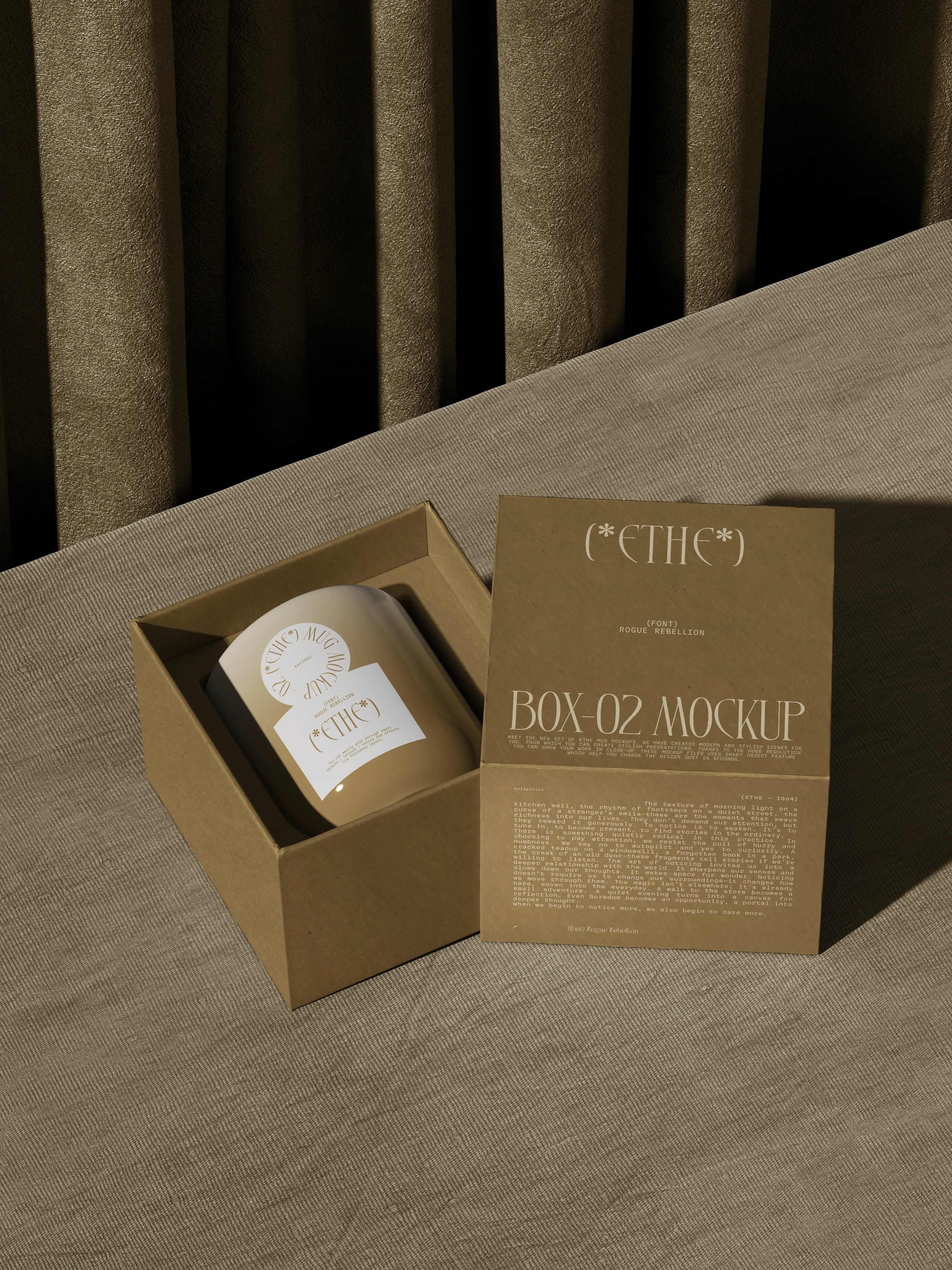
Ethe Ceramics
Code
Motion and code
23 code files, each set up in the right panel with plain names, so none need editing. Components draw things; overrides add motion to a normal layer.
Brand pieces
Cutting Mat
A craft cutting mat behind the footer: fine grid, heavier lines every five squares, ruler ticks and numbers, a dashed 45° guide. Its see-through colours (Warm Black 10%, White 22%, White 50%) take on the footer colour.
Footer
Ruled Paper
The notebook page behind every journal article: ruled lines (Blue), a faint margin line (Orange), and a band and bookmark ribbon in the Accent colour, which follows the article’s category. Margin and Ribbon Right are set per breakpoint.
Journal article
Clay Rope
A rolled clay rope that winds down behind the About story in soft S-bends (Turns, Swing, Thickness) and reveals itself from the top as you scroll (Draw on Scroll). Colour Deep Tan, Twist Tan.
About
Washing Line
The Home services slider. Rope (the default export) is one line between two clay nails at the sides (Nail Inset). It finds the Peg layers in the Track beside it and hangs every card on the rope: the line sags most in the middle (Sag), so middle cards hang low and cards dragged towards a nail ride up; it runs nearly straight from peg to peg. Colour Deep Tan, Thickness, Nails, Nail Colour Warm Black. It redraws as the line moves, also on the canvas; leave room under the cards for the sag (Track bottom padding). withWashingLine goes on the Track frame: drag with a mouse, finger or sideways wheel, momentum, springs back at the ends; the Hanging Cards swing from their pegs and bob on the rope when the line starts or stops, and the rope follows them. A click that ends a drag does not open a card. Add services by duplicating a card in the Track; keep the layer names Track and Peg.
Home
Draw Home
The 404 game. A colourful canvas with Mallow wandering bottom left and a clay house on the right (House Height). Draw a line from Mallow to the door (or back): Mallow rolls along it, tumbling through every loop, goes in, the chimney puffs and the page follows Home Link. A line that misses fades and the house shakes. On touch screens a line starts at Mallow or the house, so the page still scrolls. Colours: Background Yellow, Line and Door Warm Black, Mallow Pink, Roof Orange, Walls Pale Grey, Windows Blue; Ghost Route shows a dotted suggestion until someone draws.
404
Sent Note
Override withSentNote on the contact Form Sheet. When the Send Button switches to its Sent variant, the form folds away, the sheet’s Thanks layer (opacity 0 until then) pops in, the Mallow inside it hops, and clay confetti in the brand colours bursts from the pin. Focus moves to the note and screen readers hear it. A link in the note back to the same page (Send another) reloads it with an empty form. Keep the layer names Sent, Thanks and Mallow. Runs only in Preview and on the live site; reduced motion gets a plain fade.
Contact form
Scroll and motion
Teletype
Override that types each heading in as it scrolls into view.
Scroll Line
One giant line that slides from right to left while its tall section scrolls past, inside a sticky slab, with rounded photo chips between the words. While it moves, letters in the middle of the screen squash and flash Orange, Pink, Yellow or Lilac (a colour too close to the slab is skipped); when scrolling stops, they fade back to the text colour. Text in the Scroll Line style.
Home statement
Sprinkles
Heading override. As you scroll, a ripple of squashed, coloured letters runs through the heading in the scroll direction and springs back to the ink; hover a letter to squeeze it like a stress ball.
Section headings
Scribble
A hand-drawn marker line, straight or zigzag, that draws itself over Duration after Delay. The Recipe Step crosses a done step out with it.
Process
Tick On Scroll
Override that switches a Recipe Step to Done as it crosses the middle of the screen.
Process
Interactive
Studio Clock
Local time with an in-the-studio status.
Cal Booking
Your Cal.com calendar embedded inline. Paste your booking link.
Toy Keyboard
Key Screen shows what the key under the pointer opens and types its line out; withToyKey goes on every Toy Key and gives each one its own soft boop when pressed.
Footer
Bubble Wrap
A sheet of bubbles to pop by click or hover. Each pop springs out a card from your list: a service, fact, project, quote or photo.
Home hero
Duotone Photo
A cut-out photo tinted into one colour, masked to its own shape so a head that pops out of its panel stays evenly coloured, with an optional clay wave behind. Duotone off shows full colour (the hover), Pop Out off keeps a photo with a background inside the panel.
Team Card
Gallery Lightbox
The project gallery: photos in a tilted masonry (or an even grid) that straighten on hover. Tap one for a slideshow with arrows, swipe, keyboard, a counter, the alt text as caption and thumbnails. Bind Photos to the Gallery field; columns drop by themselves on narrow screens.
Project pages
Reel Player
A video in a clay TV, blob or panel: a muted preview near view, a tap opens a full-screen player with sound. Plays a file or a YouTube link.
Showreel, testimonials
Bead Slides
Endless testimonial slider: quotes on beads along a string; the middle bead swells into the quote bubble (Roundness sets its corners). Arrows, dots, swipe and autoplay.
Testimonials
Turntable
Override for the Work stage: project cards stand on a lazy Susan. Drag, flick, tap a side card or use the arrows to spin; the front card opens its project.
Home work
Site-wide
Page Transition
Changing page slides two sheets up over the screen, a dark lead sheet (Lead Colour) and the next page’s colour a beat behind it, with soft edges that flatten as they cover; then they lift away in the same order while the new page rises in. One instance in Main Layout; page colours come from its Pages list (a path covers its sub-pages). Skips new-tab, email and same-page links, modifier clicks and reduced motion. Framer’s own page effects stay off.
Clay Light
Casts each layer’s shadow in the colour of its own fill and softens the rim on dark fills, so a new colour brings its own shadow. Keeps the shape drawn in Framer, hover included. Runs in Preview and on the site; the editor shows the neutral shadows.
Blob Cursor
A clay bead cursor that tosses a few sprinkles on a fast flick and hangs a sticker label over matching links (View, Say hi). Off on touch screens.
All pages